How to hide Sections on mobile or desktop
To hide mobile or desktop sections on a Squarespace website using CSS media queries, you can follow the code snippet provided below:
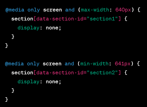
@media only screen and (max-width: 640px) {
section[data-section-id="section1"] {
display: none;
}
}
@media only screen and (min-width: 641px) {
section[data-section-id="section2"] {
display: none;
}
}
Explanation:
The code snippet utilizes CSS media queries to target specific screen widths and hide the desired sections based on their data-section-id attribute. Here's a breakdown of how it works:
- `@media only screen and (max-width: 640px)`: This media query targets screens with a maximum width of 640 pixels, which typically represents mobile devices. The section with the data-section-id "section1" will have its display property set to none, effectively hiding it on mobile devices.
- `@media only screen and (min-width: 641px)`: This media query targets screens with a minimum width of 641 pixels, which usually corresponds to desktop devices. The section with the data-section-id "section2" will have its display property set to none, hiding it on desktop devices.
Implementation:
To implement this code on your Squarespace website, follow these steps:
1. Log in to your Squarespace account and navigate to the page where you want to hide the sections.
2. Access the Page Editor for that page.
3. Identify the section blocks that you want to hide on mobile or desktop devices and note down their respective data-section-id attributes.
4. In the Page Editor, go to the section's settings or customize the CSS for the entire page.
5. Look for the Custom CSS section and paste the provided code snippet.
6. Replace "section1" and "section2" in the code snippet with the actual data-section-id values of the sections you want to hide.
7. Save the changes and preview the page to see the sections hidden on the specified devices.
8. Publish the changes to make them live on your website.
By using the provided CSS code, you'll be able to hide the specified sections on either mobile or desktop devices based on the screen width.


